Maretinda
Overview
Project overview.
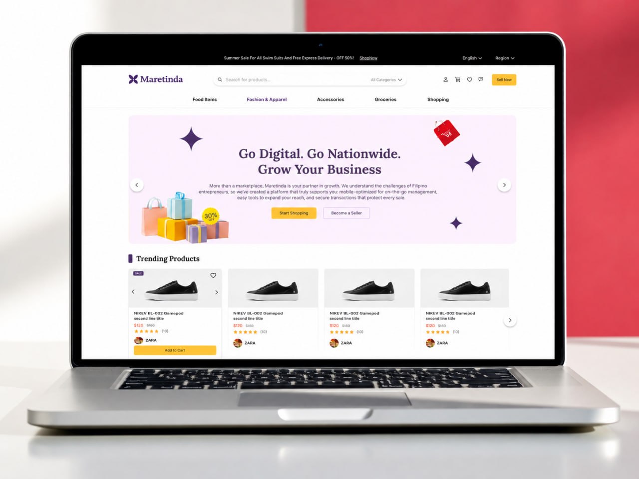
Maretinda is a multi-vendor e-commerce marketplace designed for the Philippine market, connecting buyers and sellers on one platform. It enables sellers to create storefronts, manage products, process orders, and receive payments, while providing shoppers with a secure and seamless purchasing experience. As the UI/UX Designer, I focused on the buyer experience, designing the shopping journey from product discovery to checkout. I worked closely with developers and stakeholders to create responsive and practical interfaces for the platform.
Problem
The problem.
The main challenge was creating a shopping experience that made it easy for customers to find products, understand product information, and complete their purchases with confidence. Since Maretinda brings products from different sellers into one marketplace, the interface also needed to stay clear and consistent across different types of content and user flows.
Goals
What success looked like.
- 01Make it easy for buyers to discover and browse products.
- 02Create a clear and simple shopping journey.
- 03Make product information easy to understand.
- 04Design a smooth checkout experience.
- 05Keep the interface consistent across the platform.
Research
Listening before designing.
Before designing, I researched leading e-commerce platforms such as Shopee, Lazada, Shopify, Etsy, and Amazon to understand common marketplace patterns, user onboarding experiences, checkout flows, and product browsing behavior. I also collaborated with developers and stakeholders throughout the project to understand technical constraints and business goals.
Wireframes
Structure first, polish later.
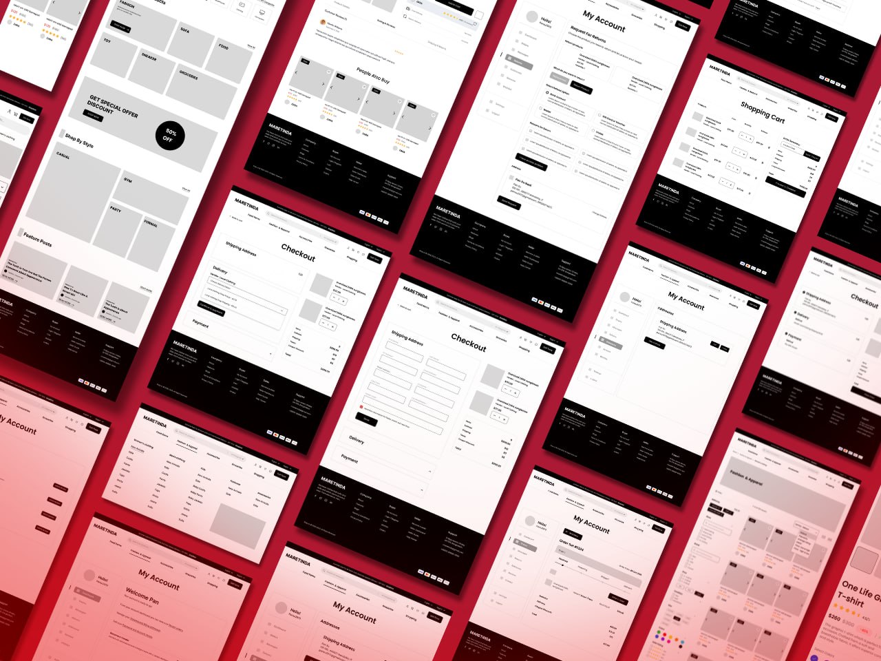
Low-fidelity wireframes were created to organize complex user flows before visual design. These included product features, utility pages, user account systems, shopping experiences, checkout processes, blog pages, and a seller guide. This stage helped validate layouts, prioritize information, and identify usability improvements early in the design process.
Design Systems
From sketches to system.
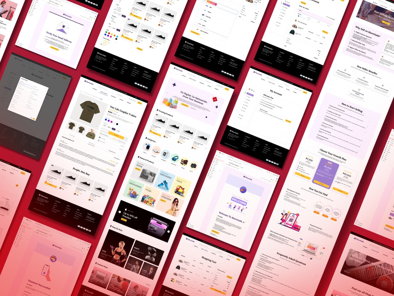
To maintain consistency across the marketplace, I built a reusable design system that included color styles, typography, buttons, product cards, navigation components, email templates, icons, a logo, and reusable UI components. The component-based approach improved design consistency and simplified developer handoff.
Decisions
Design decisions that mattered.
- Designed a clear and intuitive shopping experience from product discovery to checkout.
- Product filters for faster product discovery.
- Clear product cards for better browsing.
- Organized product details for easier decision-making.
- Seller profile section to improve trust and product exploration.
Solution
The final solution.
I designed a responsive buyer experience that helps customers discover products, explore product details, add items to their cart, and complete purchases. The final interface uses a consistent design system and reusable components to make the experience clear and easy to use across the marketplace.
Outcomes
Design Outcomes.
Easy Product Discovery
Consistent User Experience
Seamless Shopping Journey
Reflection
'What I Learned.
"Working on Maretinda taught me how to design for a real product with different requirements and technical limitations. I learned how important it is to work closely with developers and stakeholders, think about different user situations, and make design decisions that are both useful for users and practical to build. It also helped me improve my skills in responsive design, design systems, and creating consistent experiences across a large e-commerce platform."
Next Case Study