GiyaPay Dashboard
Overview
Project overview.
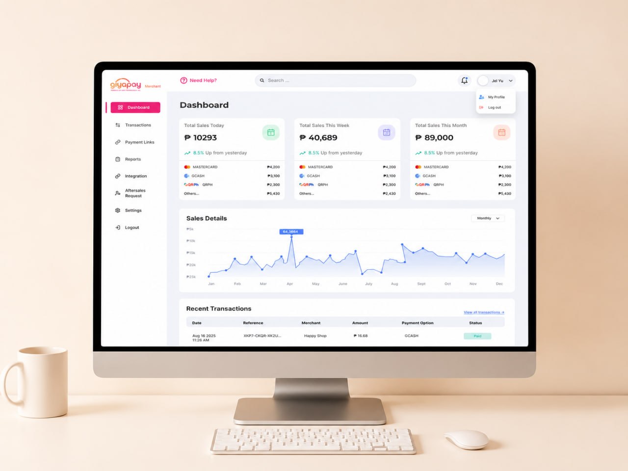
GiyaPay is a digital payment platform for merchants in the Philippines. Its merchant dashboard allows users to monitor payments, check transactions, view reports, and manage their business. I redesigned the merchant dashboard to make it cleaner, easier to navigate, and easier for merchants to find important information. I worked with stakeholders and developers and improved the design based on their feedback and project requirements.
Problem
The problem.
The existing dashboard felt outdated and was difficult to navigate. Important features were hidden inside dropdown menus, some pages had unclear layouts, and information was not always easy to scan. The main challenge was to keep the existing features while making the dashboard easier to understand and faster for merchants to use.
Goals
What success looked like.
- 01Make important information easier to find.
- 02Simplify the navigation.
- 03Improve the layout and visual hierarchy.
- 04Make frequently used features easier to access.
- 05Create a cleaner and more consistent interface.
Research
Understanding the Existing Experience
I reviewed the existing dashboard and studied common patterns from fintech, banking, SaaS, and analytics products. I looked at how these products organize navigation, tables, dashboard widgets, reports, and data. I also worked with stakeholders to understand their requirements and used their feedback to improve the proposed designs throughout the project.
Wireframes
Planning the New Experience
Before creating the final interface, I explored multiple layouts for the dashboard, transactions, reports, integration, and navigation. This process helped organize information, determine feature priorities, and refine user flows before moving into high-fidelity designs.
Design Systems
From sketches to system.
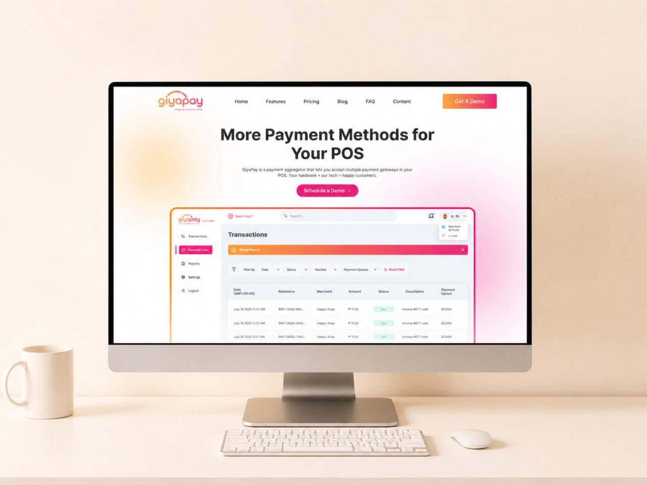
To create a more cohesive experience, I established a consistent design language using reusable components, typography, color styles, buttons, form controls, tables, cards, navigation elements, and modal layouts. This helped improve consistency across pages while making future updates easier for both designers and developers.
Decisions
Design decisions that mattered.
- Redesigned the dashboard with summary widgets for daily, weekly, and monthly sales.
- Improved the transaction management experience by introducing cleaner filtering and table layouts.
- Added support for merchant filtering for administrator accounts managing multiple merchants.
- Reorganized navigation by moving frequently accessed features into the main sidebar.
Solution
The final solution.
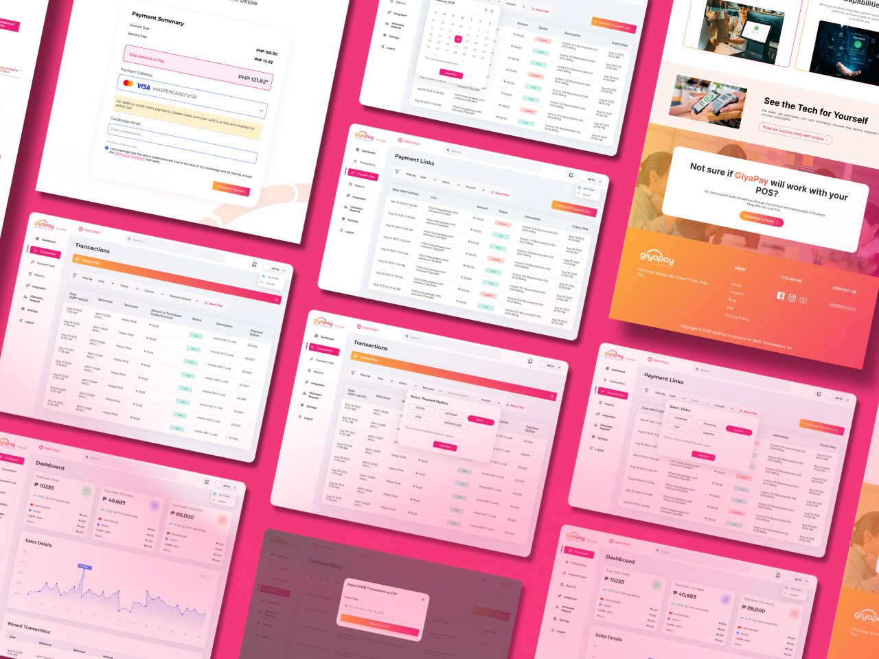
I redesigned the dashboard with a clearer structure, simpler navigation, and better ways to view important business information. Merchants can now quickly check sales, manage transactions, view reports, and access other tools from a more organized interface. The new design also uses reusable components and consistent layouts, making the dashboard easier to maintain and expand as the product grows.
Outcomes
Design Outcomes.
Cleaner and more professional dashboard interface.
Improved navigation and information hierarchy.
Better visibility of business insights through dashboard widgets.
Reflection
'What I Learned.
"This project taught me how to improve an existing product without starting from scratch. I learned how to balance user needs, business requirements, and technical limitations while making the interface easier to use. Working with stakeholders and developers also helped me understand the importance of feedback and iteration when designing a real product."
Next Case Study